Menu
Medical branding for a specialist Brisbane practice treating rheumatism and arthritis.
Project Scope
- - Logo Refinement
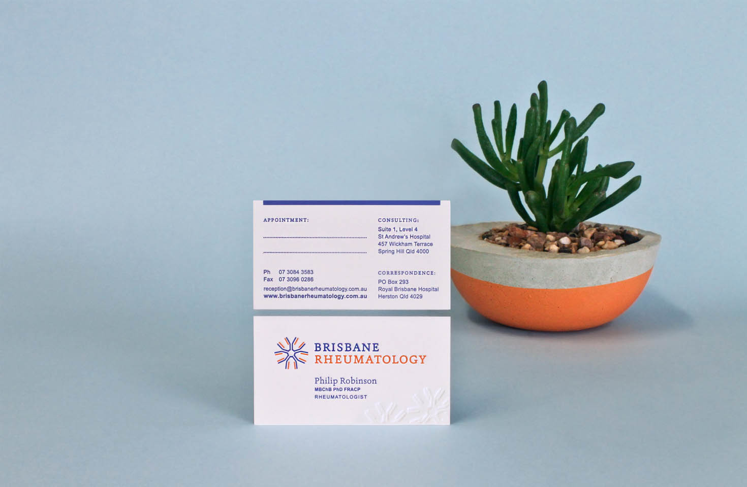
- - Letterpress Appointment Cards
- - Corporate Stationery Design
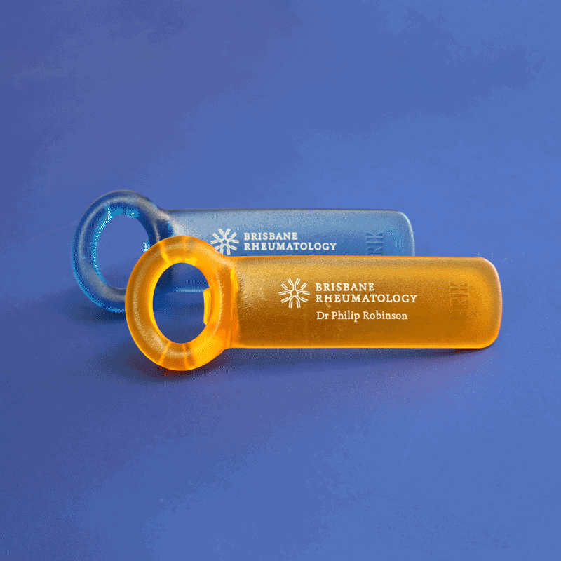
- - Promotional Products

The JarKey opener is designed for people with weak grip or arthritic hands — a useful product for Brisbane Rheumatology’s patients. A vibrant colour will stand out in any kitchen drawer; the practice logo pad printed to the handle in white ink.
Simplifying the icon and increasing white space around elements to achieve a more friendly and modern aesthetic.
The icon symbolises the IgM antibody, made by the bodies immune system to fight infection and prevalent in the onset of RA, an auto-immune disorder.
A simple typography change to the business name gives the service 'Rheumatology' more prominence. The brand offer is now clearly understood.